Lighthouse Escrow
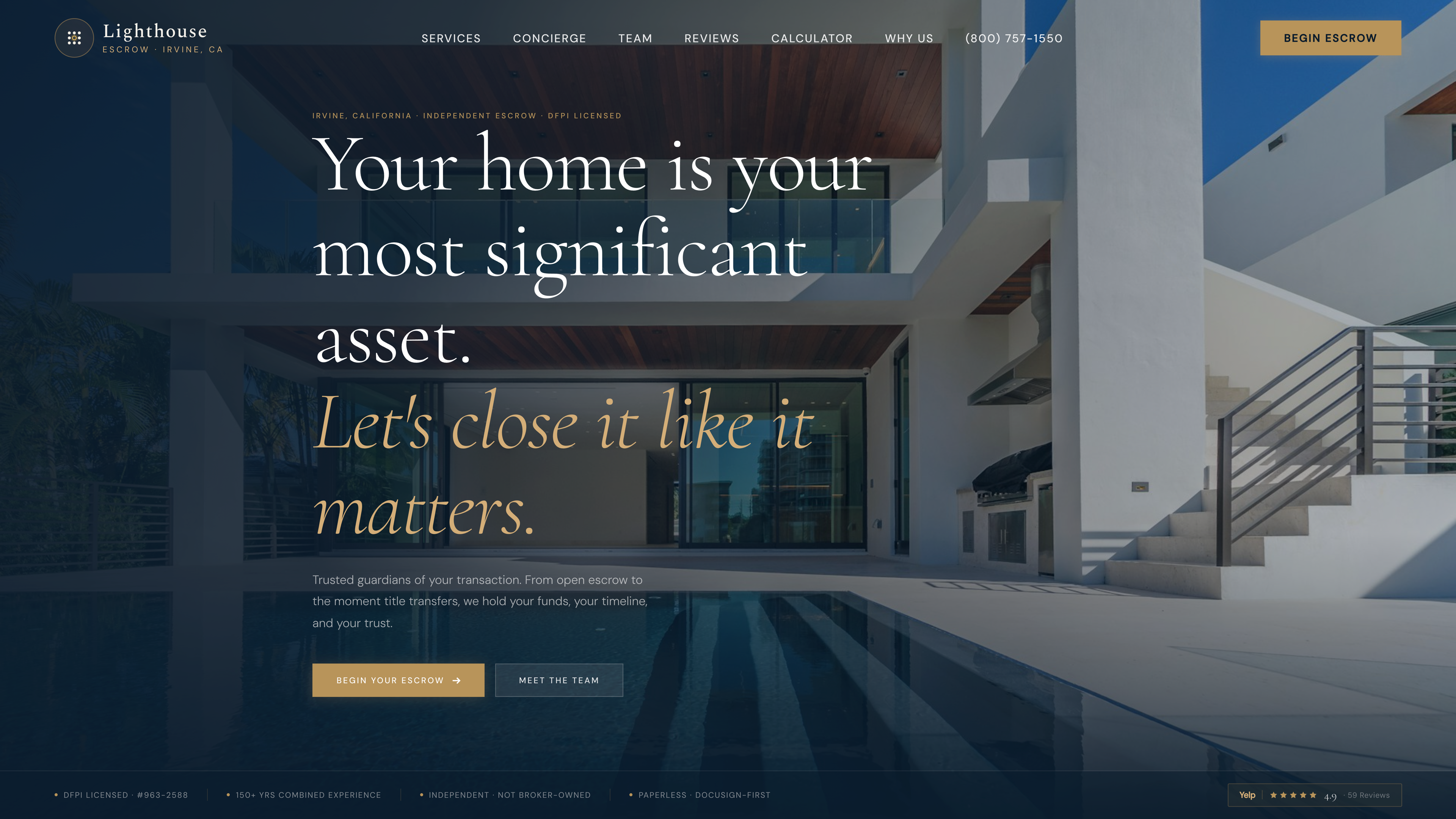
A landing page redesign I designed and built for Lighthouse Escrow, an escrow company that guides home buyers and sellers through closing. Their existing page was friendly but did little to convince a first-time visitor to pick Lighthouse over the next escrow company open in their browser tabs. It lives as an interactive demo with placeholder content, built to hand the client a concept they can react to rather than a spec they have to imagine.
The problem
A visitor arrived to 'Hello, home sellers and buyers,' a warm greeting that never says what Lighthouse actually does or why anyone should stay. From there the page asked them to scroll past large standalone images that looked good but pushed the useful content — trust signals, a clear call to action — further down the page.
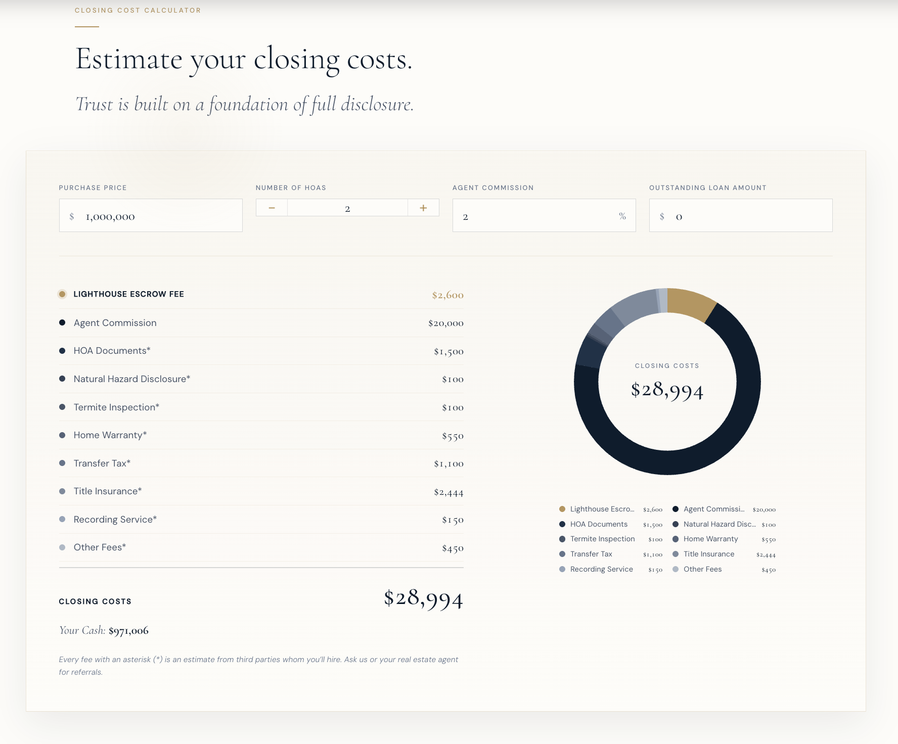
The closing cost calculator, arguably the most useful thing on the page, loaded empty with a donut chart reading 'Closing Costs: $0,' which reads less like a tool waiting for input and more like something broken. Further down, sections repeated each other, a few buttons led nowhere, and despite a strong wall of Google reviews, none of that social proof showed up anywhere a visitor would see it.
None of these were bugs exactly. The page worked. It just quietly gave a comparison shopper every reason to close the tab, which for a trust-heavy purchase like escrow is the whole game.
Goals for the redesign
- Tell a visitor what Lighthouse does and why it matters within the first few seconds, above the fold.
- Put trust up front — closings handled, years in business, rating, and real client reviews — instead of burying it.
- Make the closing cost calculator useful on first glance, before anyone types a thing.
- Cut the repetition so the page is short enough to scan and every section earns its place.
Why redesign instead of patch
Each problem on the page had an obvious small fix: rewrite the headline, swap an image, seed the calculator with a number. Taken one at a time, though, those patches would have left the same page underneath. The issues shared a root cause: a layout that spent its best real estate on decoration and made the visitor work to find the substance.
So the redesign starts from the visitor's decision instead of the existing structure. The hero leads with a plain headline and puts trust metrics and a call to action where the eye lands first. Images become full-bleed backgrounds that carry the same visual weight without costing vertical space. The calculator opens pre-populated with a realistic $750,000 example and trades the donut chart for an itemized breakdown that says more in less room. Redundant sections collapse into distinct ones, each with a single job.
Conditions and constraints
The visitor is almost always comparison-shopping, often with two or three escrow companies open at once, deciding largely on trust before a single conversation happens. That set the bar: the page has to earn credibility fast and without a salesperson in the loop, which is why review scores, concrete numbers, and a clear next step do so much of the work.
It also had to read as a proposal, not a finished product. Everything, including the testimonials and metrics, is placeholder — meant to show the shape of the page and let the client drop in their real reviews and numbers. The point wasn't to ship production code; it was to make the redesign concrete enough that the people who own Lighthouse could look at it and say yes.